LiveRamp Rebrand
Senior brand designer
TIMELINE
July 2021 - June 2022
DELIVERABLES
Brand identity and evolution, marketing collateral
Design team: Phil Winfield (creative director), Lyn Peyok (senior designer), Allison Gregory (designer), Katie Bielawski (designer)
Photography: Michael O'Neill
Illustration: Timo Kuilder
Getting started
Working with an agency, we evaluated concepts pitched to senior leadership, creative and content, directing the agency with our informed perspective. We eventually honed in on the concept shown, which we felt spoke directly to our messaging of radical simplicity, trustworthiness, innovation, and maturity.
We loved the bold color palette and grid-based framework, and how elegantly it represented the endless possibilities LiveRamp can provide.
The /L represents acceleration and upwards advancement, and is an nod to one of LiveRamp’s key marketing events, RampUp. It also evokes the idea of a computer terminal, speaking to developers.
We were drawn to the potential of the grid- how it could push, pull, and adapt to content, just like the LiveRamp product empowers customers to do more with their data.
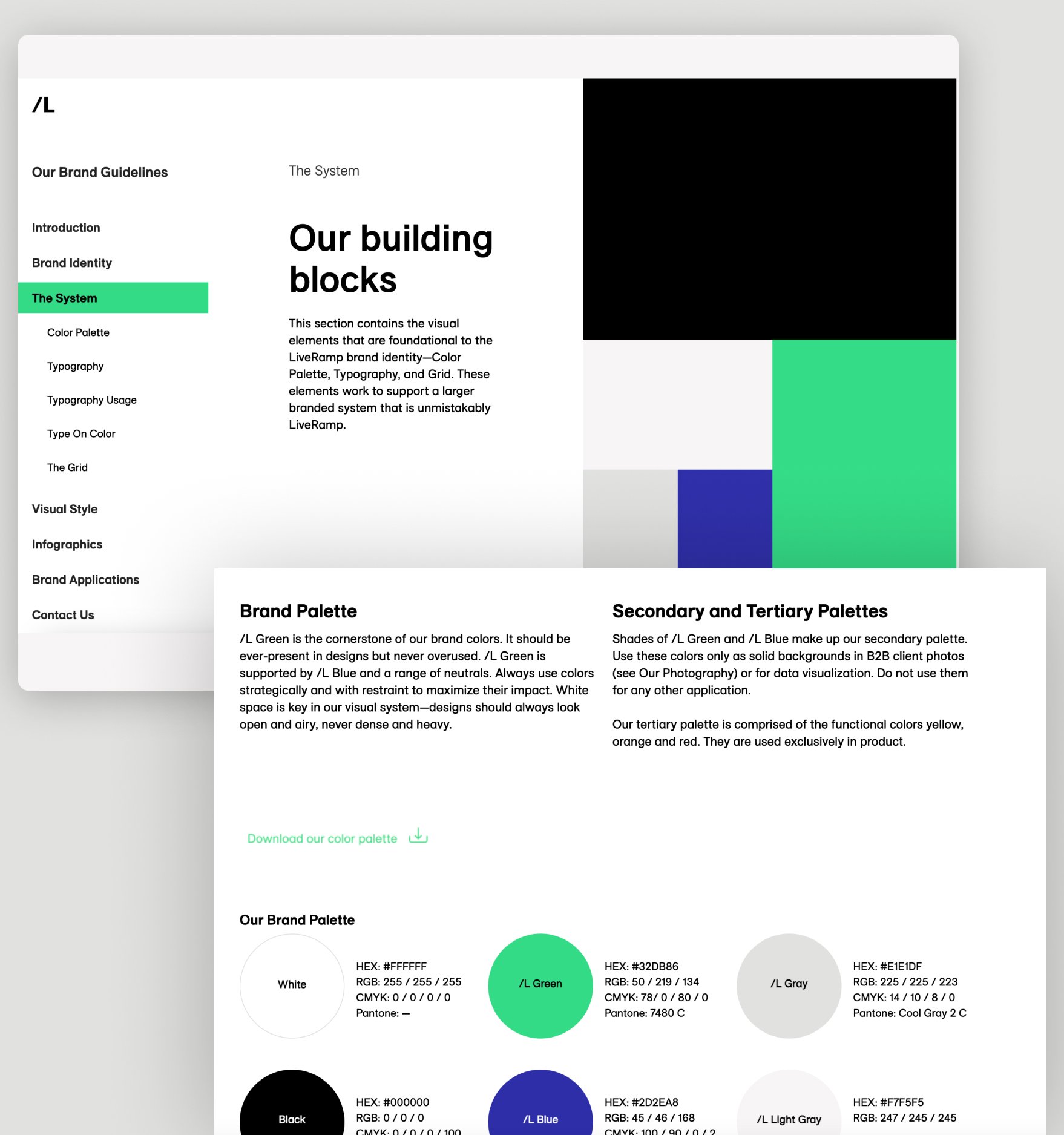
Guidelines
Together, we established interactive brand guidelines that the agency built out, ensuring easy access and streamlined updates moving forward.
Illustration
Once we had the brand foundation, the creative director and myself sought out an illustration style that would elegantly contrast the structured grid. We wanted a soft, organic look that felt mature and modern.
We selected the artist Timo Kuilder, who we found in the New Yorker— the perfect institution to represent the editorial style we were looking for.
I worked with Timo to test out the illustrations on our most commonly used assets, seeing how they co-existed with content. We settled on this in-between style that felt pared back and illustrative, but still had some element of color and vibrancy.
Final illustrations
Photography
We evaluated our photography needs and combined them with our creative vision for the brand: humanistic, mature, c-suite professionals in tech unlocking new insights with their data.
The creative director and I chose talent, furniture, props, and put together a shot list that met our needs.
We also identified our key target personas and staged desktop ‘scenery’ for each, including retail, CPG, legal, and developers.
Animation
As design lead, I expanded LiveRamp’s brand guidelines to include animation, focusing on how animation reflects the brand’s messaging and how to execute and teach the process to others.
Steps included:
Needs assessment
Behavior continuum
Motion direction for iconography, color blocking, design elements, and typography
I wrote and designed these guidelines to help translate the LiveRamp motion language for vendors, agencies, and designers
IN USE
Starting with the fundamentals from Emotive, myself and the creative director defined how the brand existed in much greater depth, as shown here.
Takeaway
LiveRamp’s new brand helped reframe the company as it transitioned to a more simplified and intuitive user experience. The illustrations, animation, photography, and art direction we provided, in tandem with the agency, helped effectively guide the company in to a new era and revitalize the brand identity into the adtech powerhouse it is today.
In addition, I used my fluency in the brand language to help fully scale the brand foundations into a full blown, evolved identity that spoke to its audience across every platform.


